
Widget Watch
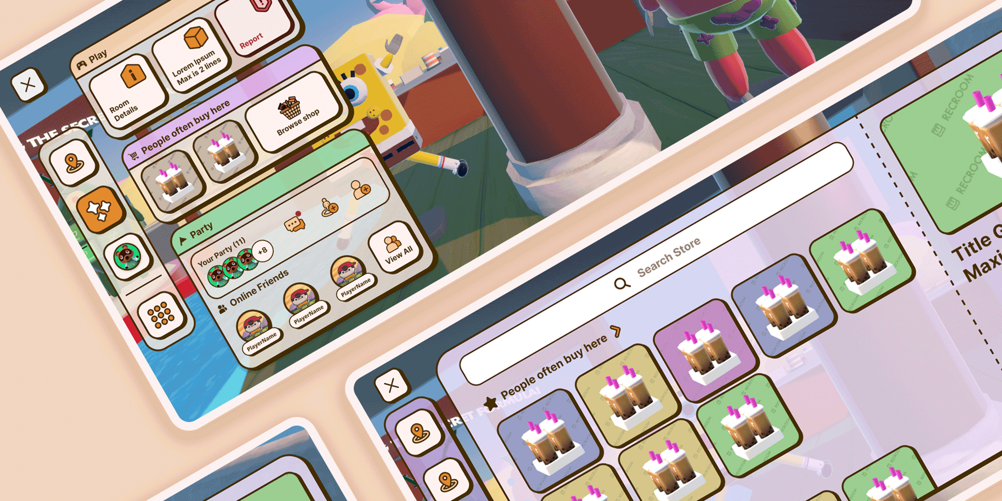
Creating a scalable UI framework for Rec Room by starting with a contextual menu system that surfaces the right actions at the right moment, without breaking immersion
My Role
The need for a UI overhaul was broadly recognized, but the scope and framing were undefined. I shaped the project from a narrow "fix the menu" initiative into a systems-level effort by defining how UI surfaces, IA, and interaction patterns should work across four platforms, and establishing governance rules that other teams could build on.
- Championed system-level UI architecture for future scalability
- Aligned UI strategy with long-term platform vision and user needs
- Established UX governance rules for the company
- Defined & managed roadmap balancing short-term and long-term needs
- Provided hands-on design execution
- Collected and analyzed data and player feedback to drive iterations
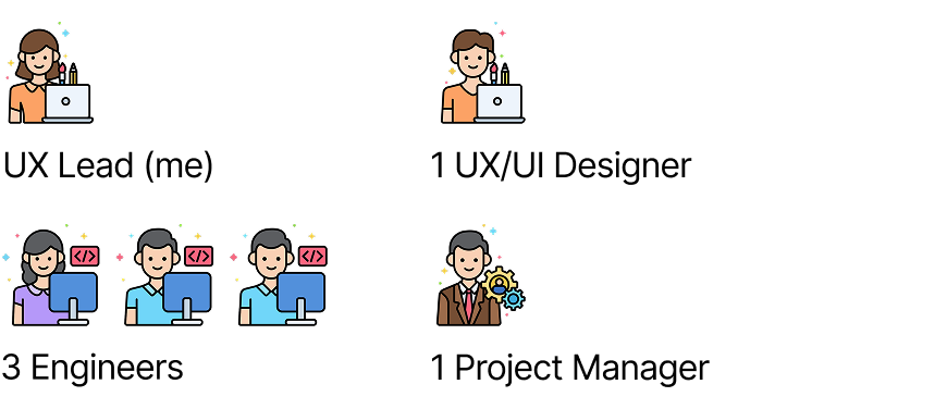
My Team
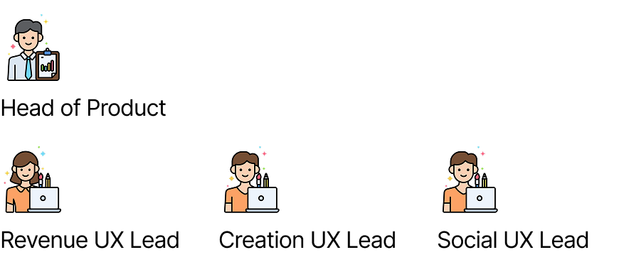
Stakeholders
A platform with a one-size-fits-all menu
Rec Room is a UGC social gaming platform where players aged 7–25 create, play, and socialize across VR, mobile, console, and PC. Players jump between short 10–15 minute experiences without a clear start or end. Discovery needs to feel like part of the core loop.
After two previous UI iterations, the current system (RRUI) prioritized implementation speed over player needs. As the product grew, the menu became cluttered, hard to navigate, and caused performance crashes on lower-end devices.
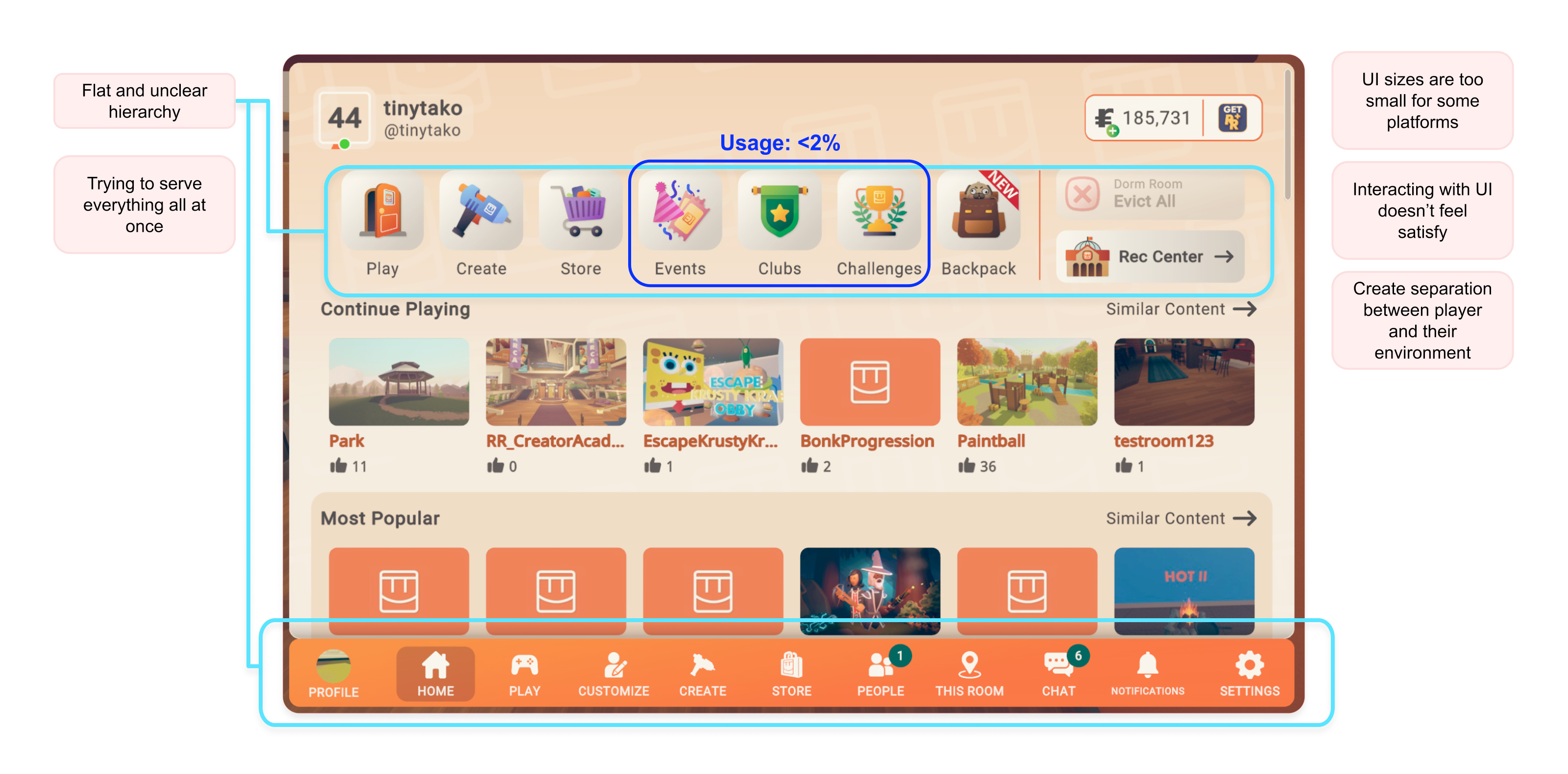
Through data analysis, CI surveys, player interviews, and Discord feedback, I identified three core issues:
The menu tries to serve everything at once, regardless of context
Interactions have poor usability and feel generic
The UI disrupts the social experience that Rec Room is built around, pulling players out of shared moments
The existing UI only served one type of player
I led research across CI surveys, Discord feedback, player interviews, and usage analytics, then validated findings through A/B experiments that confirmed not all features carry equal weight.
Using these insights, I mapped a golden path user journey to identify key pain points. Most friction lived in the discovery phase, where low intention players couldn't quickly find resonant content. I also spotted opportunities to surface meaningful content during play and replay to enhance the experience and inspire return visits. Parallels to real life social activities revealed further opportunities: contextual in-moment purchases and multiplayer UI where friends browse and decide together.
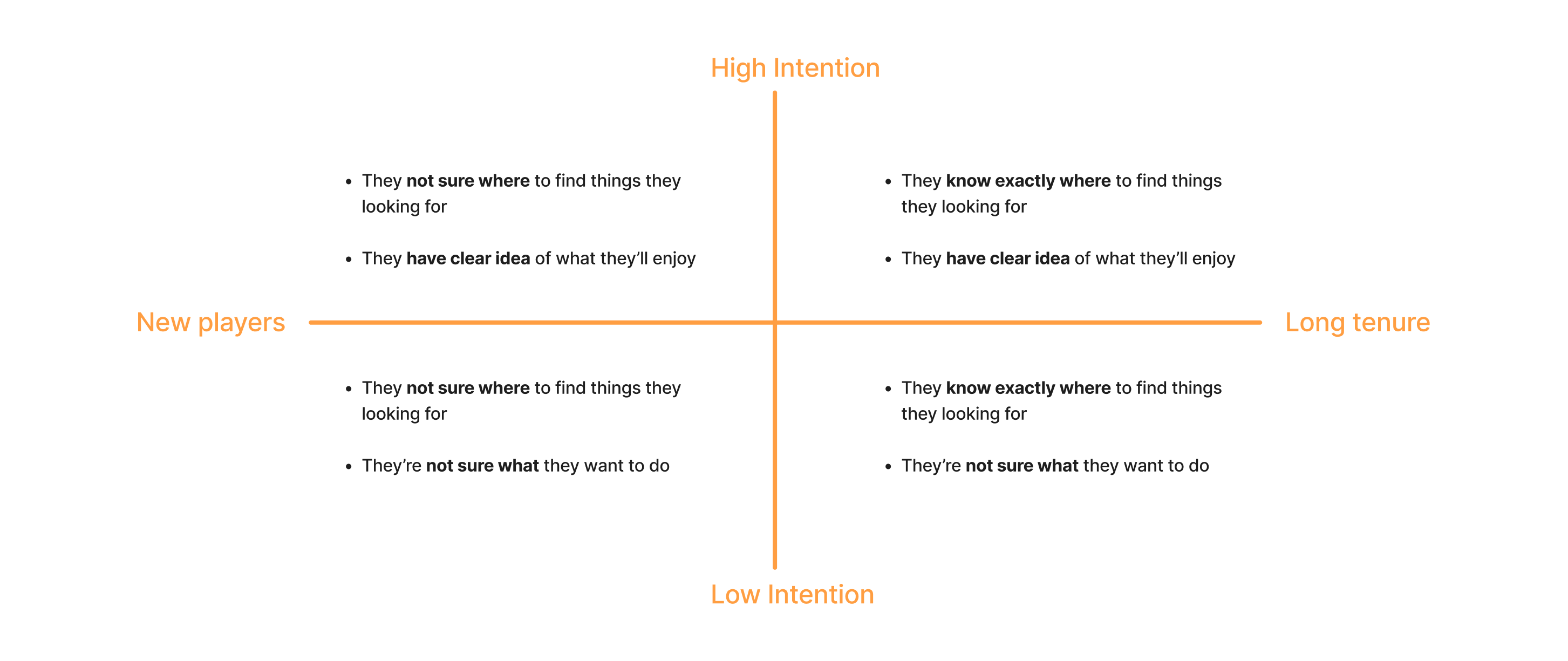
Distilling these findings with stakeholders, I defined browsing personas along two axes (tenure and intention) and discovered the existing UI only served high intention, long tenure players, leaving three of four quadrants underserved.
Usability & UI Surfaces
I started by questioning a fundamental constraint: does the UI always need to be full-screen? The existing system only allowed one surface size, making every interaction equally heavy.
Key Decision 1: Adaptive surfaces that scale to player focus
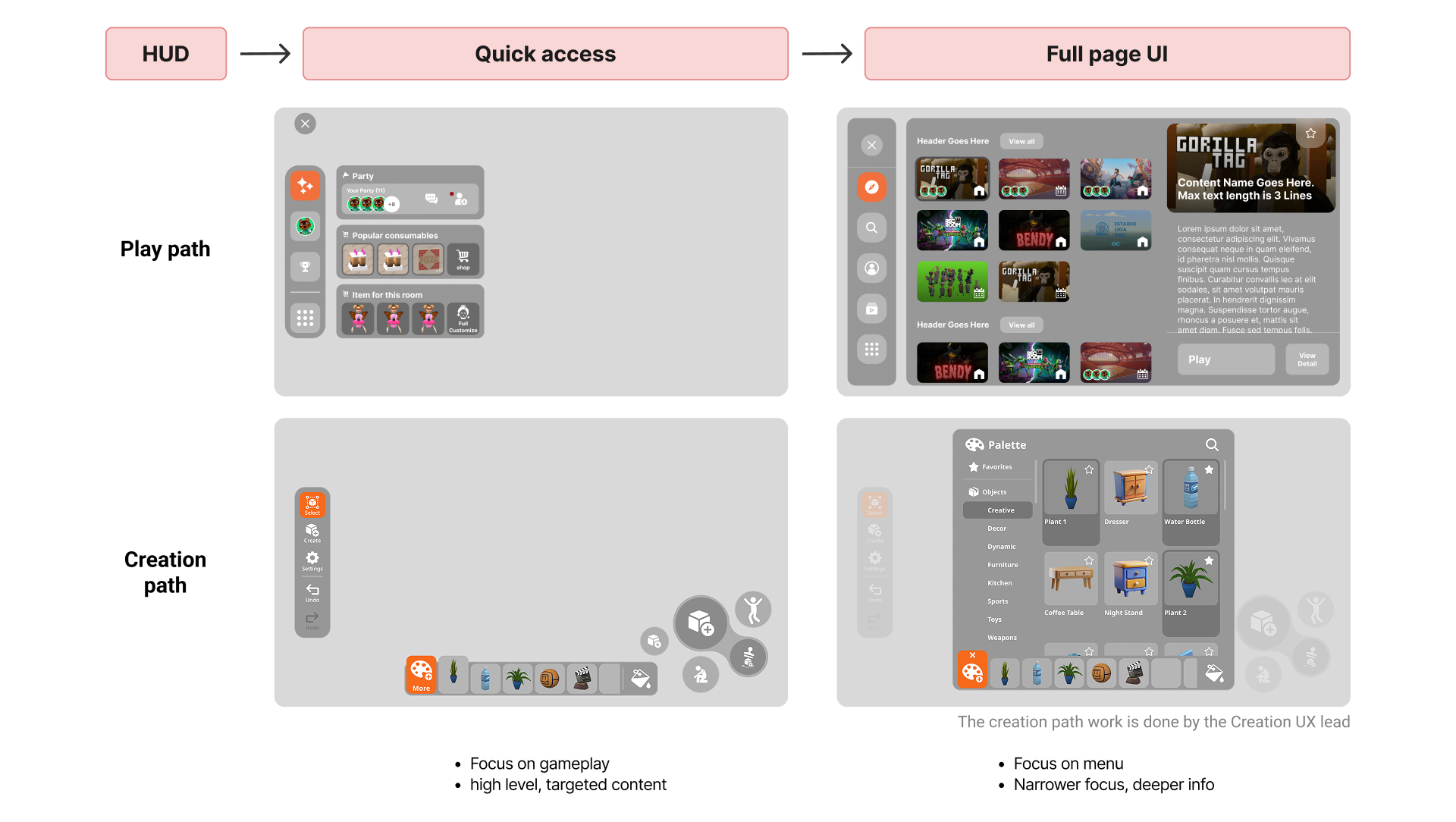
I designed adaptive UI surfaces that scale based on player intent: a lightweight menu for quick actions and full-page views for deep exploration.
After aligning with all stakeholders, I worked with the Creation UX Lead to establish Quick Access and Full Page as a unifying principle across the product.
Key Decision 2: Platform-native interactions from day one
Rather than retrofitting one design across platforms like RRUI, I advocated for a multi-platform approach from day one by optimizing for each platform's interaction modality, such as controllers vs. direct touch, sizing and spacing for display comfort, and haptic feedback where available.
For implementation, we decided to tackle one platform at a time, starting with the most impactful: mobile.

Information Architecture
Earlier IA explorations grouped features by activity or entity. While logical on paper, these required too much effort from low-intention players. I expanded the 'focused and adaptable' thinking into IA by creating a surface hierarchy framework that defines different types of UI surfaces based on the player's cognitive state and when they would encounter each one.
Key Decision 3: Surface hierarchy framework based on cognitive state
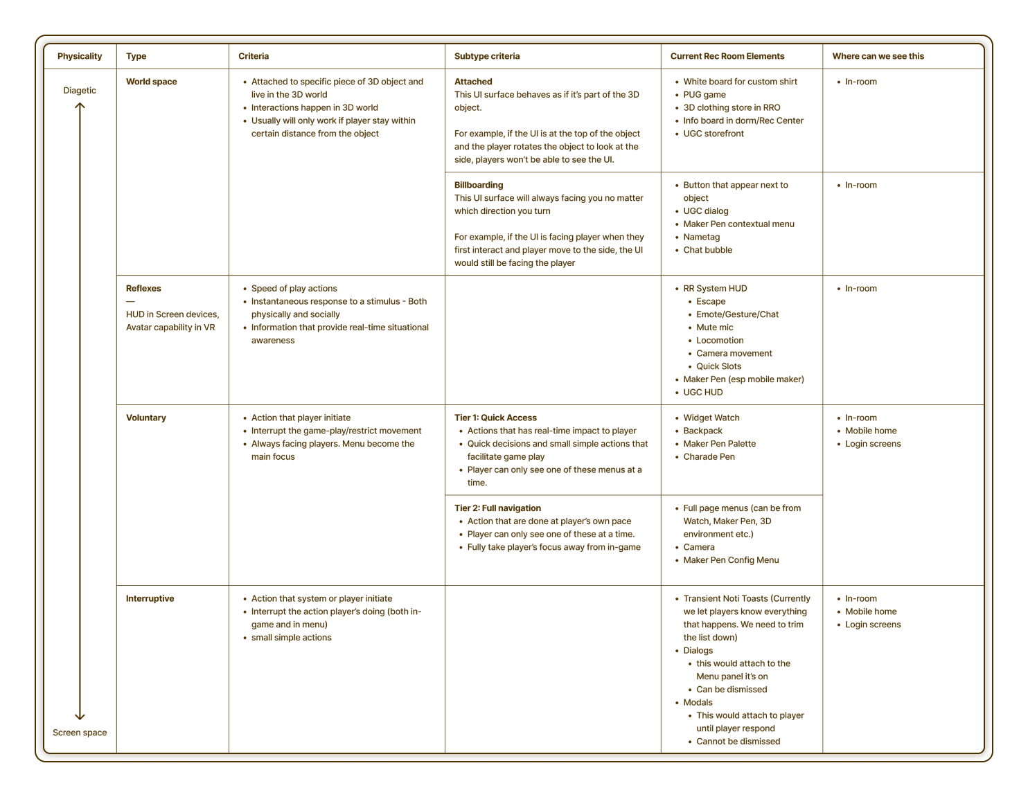
Through work sessions with stakeholders, I established a UI Surface Hierarchy framework that defines the criteria for surfacing features based on gameplay cognitive states, such as reflexive vs. voluntary actions. This aligned with how we categorize actions in the HUD.
These rules determined which features should appear where and how much presence each should have.
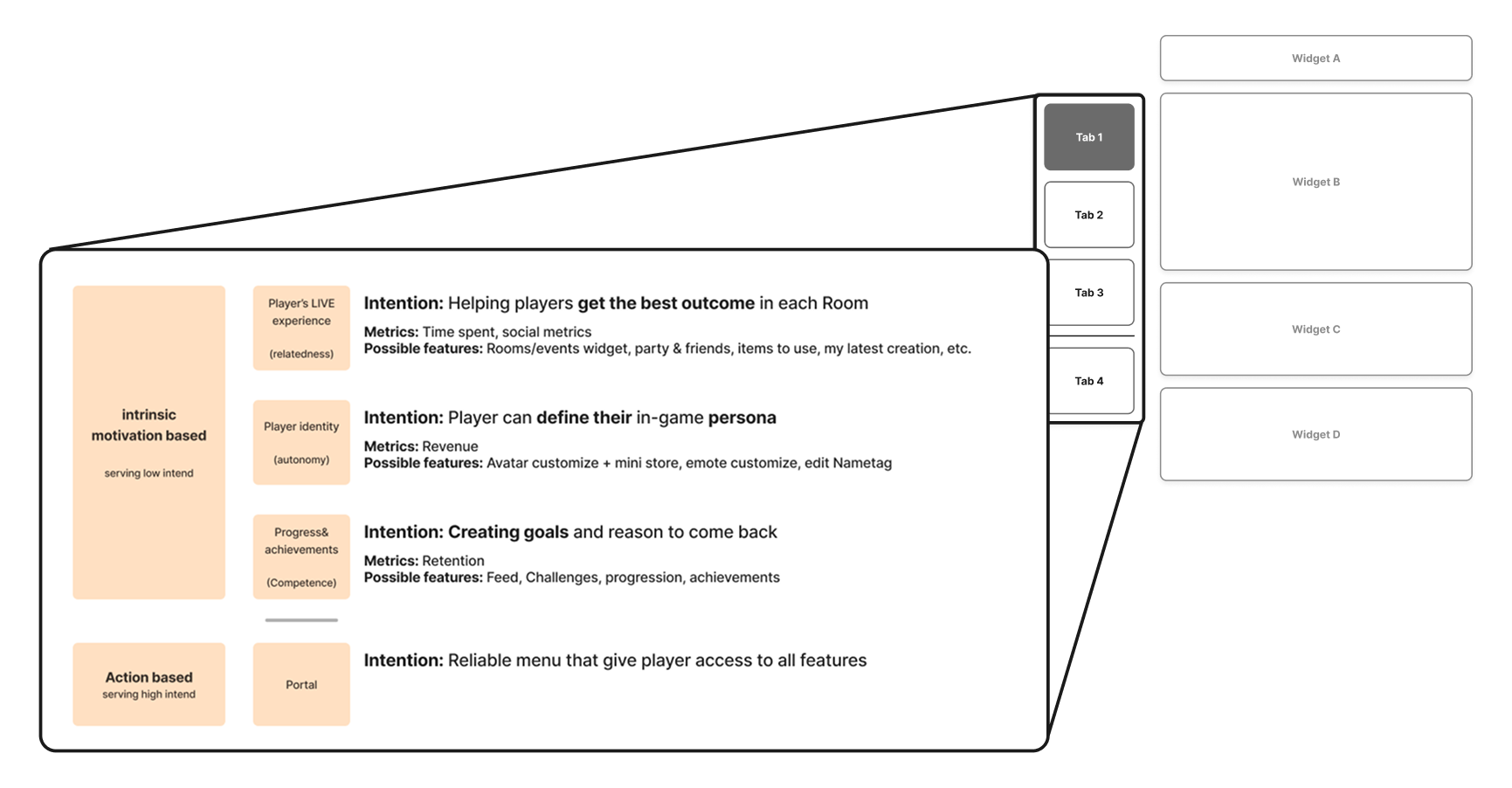
Key Decision 4: Motivation-based IA for the Quick Access menu
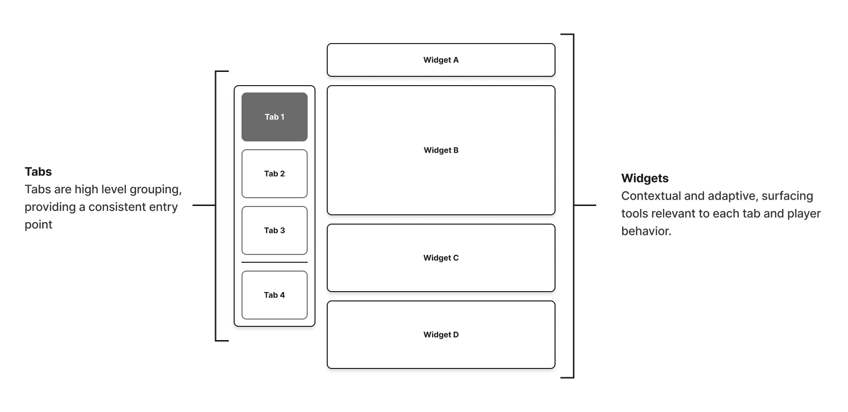
Five tabs maximum, each with independent widgets. The first three tabs serve low-intention players organized around intrinsic motivations: Relatedness, Autonomy, and Competence. The final tab uses action-based grouping for players who already know what they want.
Visual Design
Style Exploration & Audience Feedback
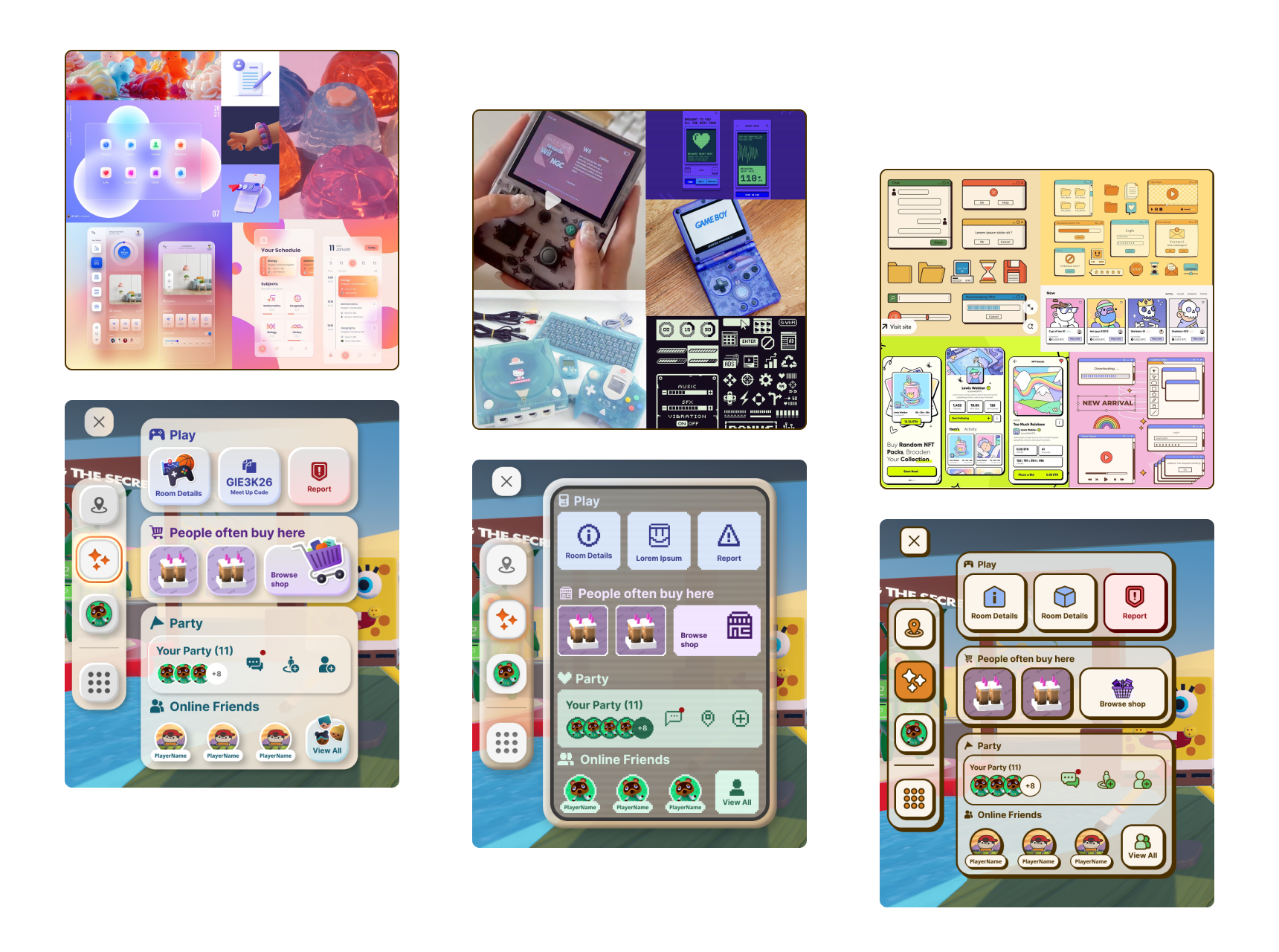
We shortlisted three visual directions informed by Rec Room's VR origins, our Gen Z audience's affinity for retro-futuristic aesthetics, and player feedback calling for more tactile, physically responsive interactions.
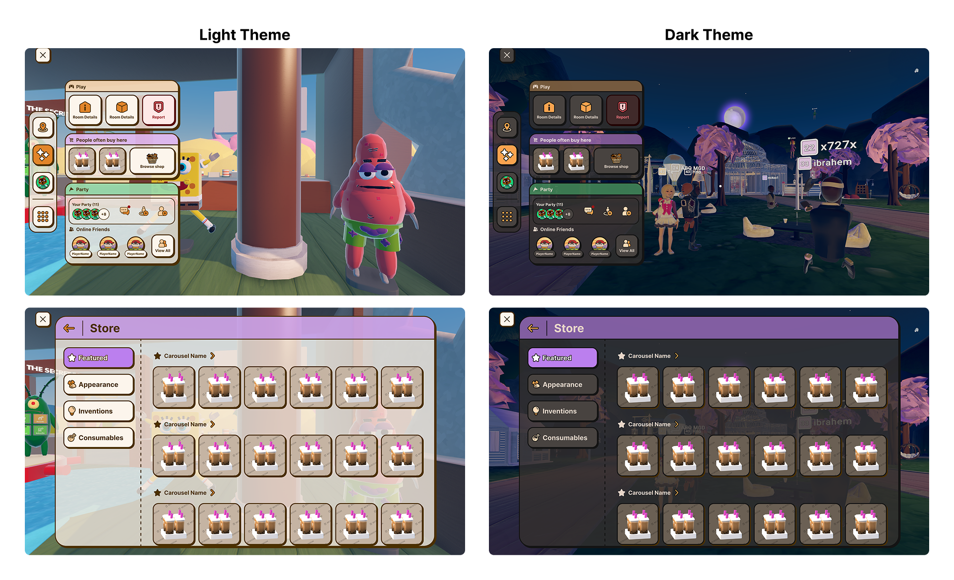
From there, we ran a player survey to identify the preferred style, then iterated to ensure scalability, consistency, adherence to all guidelines, and a clear visual language across the interface.
Design Principles

OVER Multiple systems
- Adapts to different user needs
- UX is platform native, while IA is consistent
- UX for casual players aims to be on the simpler side while highly optimized for experts
- Retain cohesion across all experiences for seamless transition

OVER Open exploration
- Less is more. Showing relevant actions and content
- Adaptable to company’s direction
- Bringing actions and content to players as opposed to them finding content on their own

OVER Sleek & minimal
- Opinionated UI look and feel to tell Rec Room story
- Inspired by 80s-90s graphics and a nod to VR
- Tactile interactions that give sensory satisfaction
A system that adapts to the player
A contextual menu rooted in the player's motivation, providing quick paths for casual players and depth for committed ones, all delivered in a platform-native, physically satisfying interface.

From vision to measurable impact
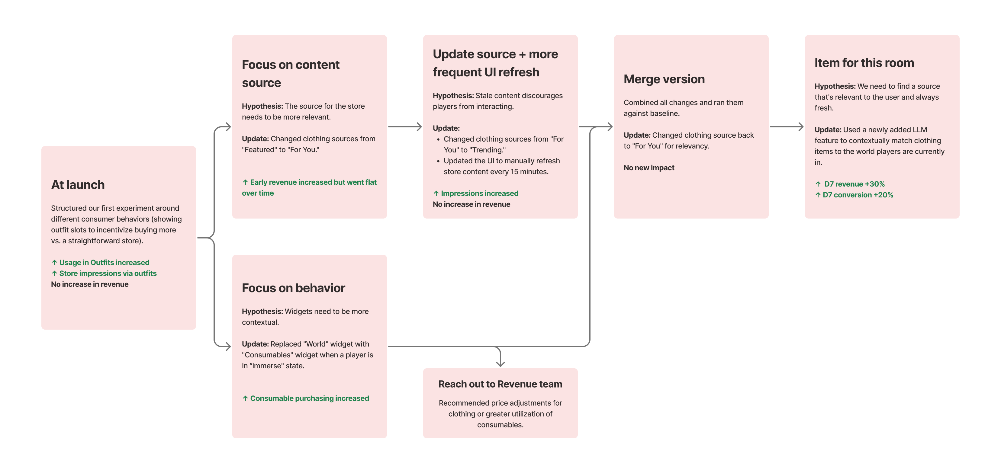
With revenue as the production goal, I drove the experiment roadmap by breaking the vision into testable hypotheses where each round built on the last.
Experiment Results
After 10+ experiments over 3 months, we increased revenue metrics through LLM-powered contextual content that matched items to game themes. This proved that in-the-moment relevance drives both player experience and business outcomes.
+30%
+20%
Player Sentiments
After the MVP launched, players shared positive sentiment, noting a more intuitive and less cluttered design.

Interfaces Framework for the Company
Widget Watch was the first application of a broader UI framework. The systems I created now influence how other teams make UI decisions.
Surface hierarchy framework
Now referenced by the Creation team for the new creation tool, and by the Social team for HUD social interactions.
Quick Access / Full Page model
Co-developed with the Creation UX Lead, now the standard interaction model for play and creation flows.
Motivation-based IA
The Revenue team co-owns the Player Identity Quick Access tab to explore subscription upsell opportunities.
How this shaped my practice
1. Principles and goals are the best alignment tool
During visual design, multiple directions were proposed based on personal aesthetic preferences, and conversations kept circling. Instead of debating style, the Revenue UX Lead and I defined what we needed the visual design to accomplish and filtered every direction through those lens. This shifted the conversation from "which do we like" to "which serves our goals," and produced a direction that resonated with players in survey testing, not just designers in review.
2. Start small to go big
When I first proposed Widget Watch, leadership, while agreeing with the principles and design, was concerned about disrupting live production and player experience. Rather than pushing for a full rollout, I proposed a vertical slice experiment that could validate the direction without a wholesale rebuild. This gave leadership confidence to iterate safely and gave the team a concrete deliverable instead of an abstract vision. Ambitious systems work earns trust through small, low-risk proofs, not through the strength of the pitch.
3. Take stakeholders along the journey
Early on, my instinct was to research independently and bring polished recommendations to stakeholders. The feedback was that this made some of them feel excluded from conclusions they hadn't been part of reaching. I shifted to running collaborative design sessions earlier, inviting stakeholders into research synthesis and rough exploration before anything was finalized. The result was stronger ideas because they brought context I didn't have, and smoother alignment because they'd helped shape the direction.